Look, Mira
Situation: Kate McCarthy, screenwriter and director, created the short film “Look, Mira,” a coming-of-age film about a socially awkward girl taking on her biggest challenge yet: auditioning to be church cantor at her Christian high school.
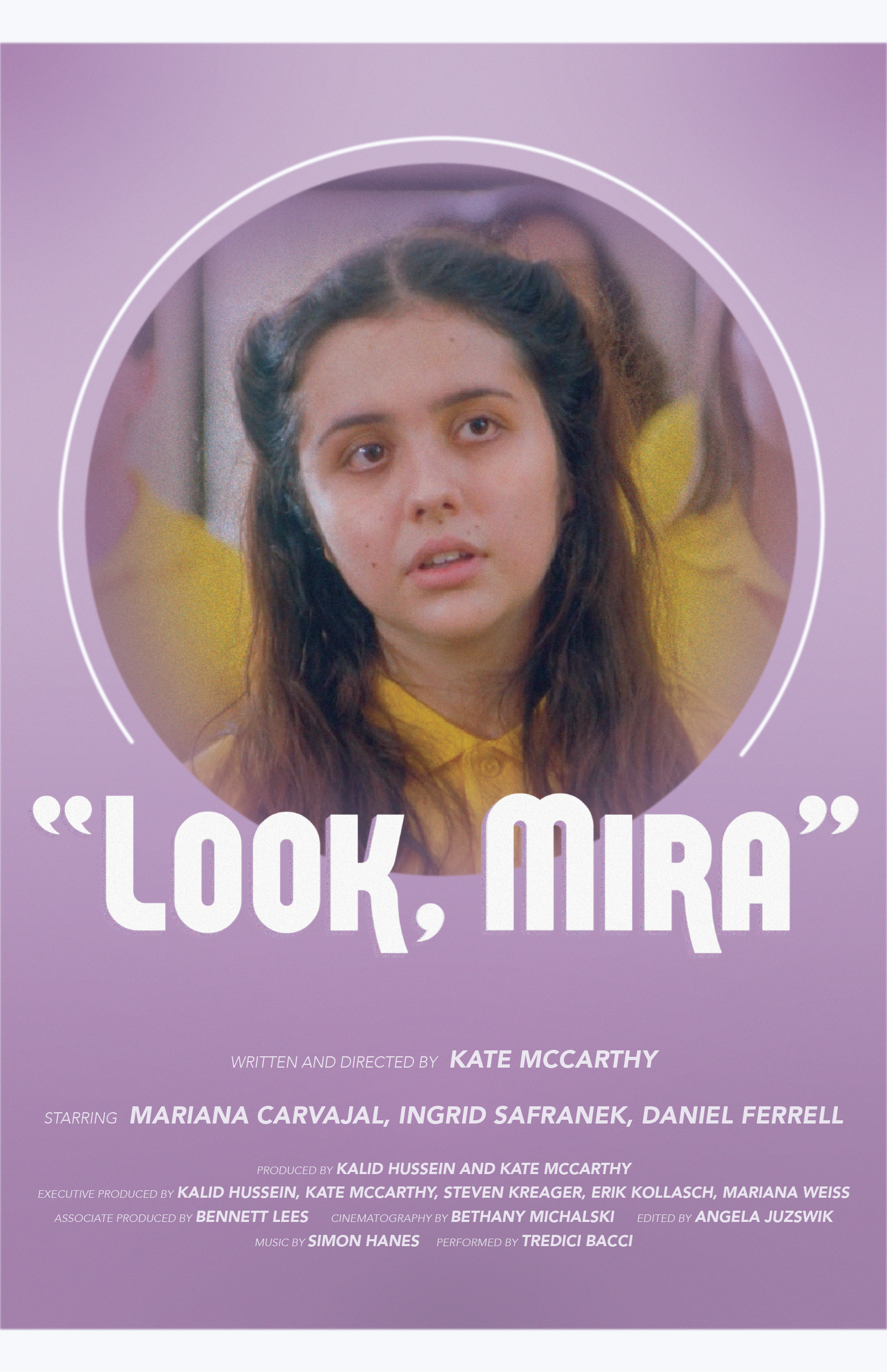
Task: I was tasked with designing the opening title of the film, which needed to convey the discomfort of adolescence but have the boldness and classic feel of the golden age of film. Additionally, I designed the theatrical poster and a graphic for social media.
Design Approach:
After a discussion with Kate, we decided to go in an old-hollywood direction for the opening title. The film tells a simple story of not fitting in in such a grand way, with a swooping score and loads of color, and we felt that we wanted to support that contrast with the look of the main title.
One of Kate’s favorite visual references was the opening title from “Singin’ in the Rain,” so I chose a similar typeface and experimented with the shadow, and I used the grain and blur effects to achieve a retro feel. I chose a cream and lavender color palette to evoke young girlhood.
For the posters, we knew we wanted to feature the dissociative expression of the main character, and to continue with the retro, old-hollywood feel.
Conclusion: Kate loved the final graphics, and felt like the main title had the desired impact. The boldness and sweetness of the design was the perfect introduction to the story of “ Look, Mira", and the posters were very effective as well in drumming up interest about her project.

Poster V1

Poster V2

Social graphic

