Spolin
Situation: With a dream of bringing Chicago-style improv to Minneapolis, Mikala Bierma, Christina Boucher, and Julia Weiss teamed up to build an ensemble named after Viola Spolin, one of long-form improv’s inventors. They booked a 3 month run of Friday night shows at Huge Theater.
Task: I was tasked with designing the promotional graphics and the social media graphics to match the chaotic energy and irreverent playfulness of the show, and help build excitement for the whole length of the run.
Design Approach:
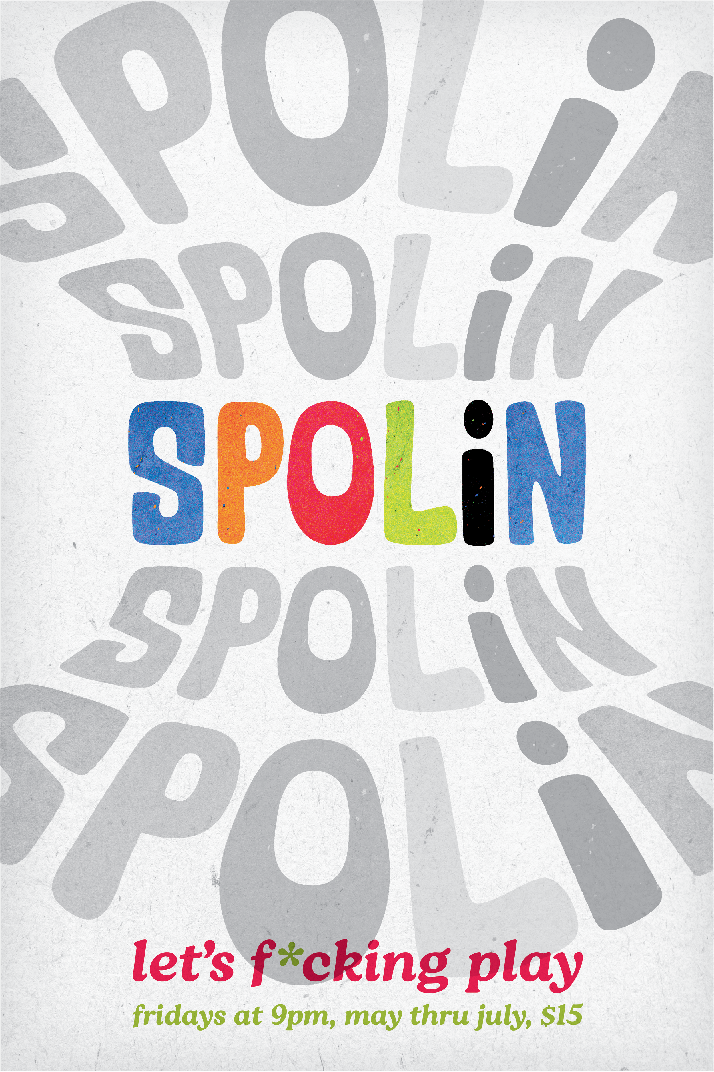
Mikala already had a typeface she liked the feel of, and so I used that as a jumping off point. After tweaking the spacing and colors, I decided to had a construction paper texture to the lettering that helped to reinforce the scrappy and fun vibe.
I experimented with different warp-effects and settled on a 70’s-esque shell-warp that felt almost like a game show, which I was able to adapt for all the different sized and ratios for the posters.
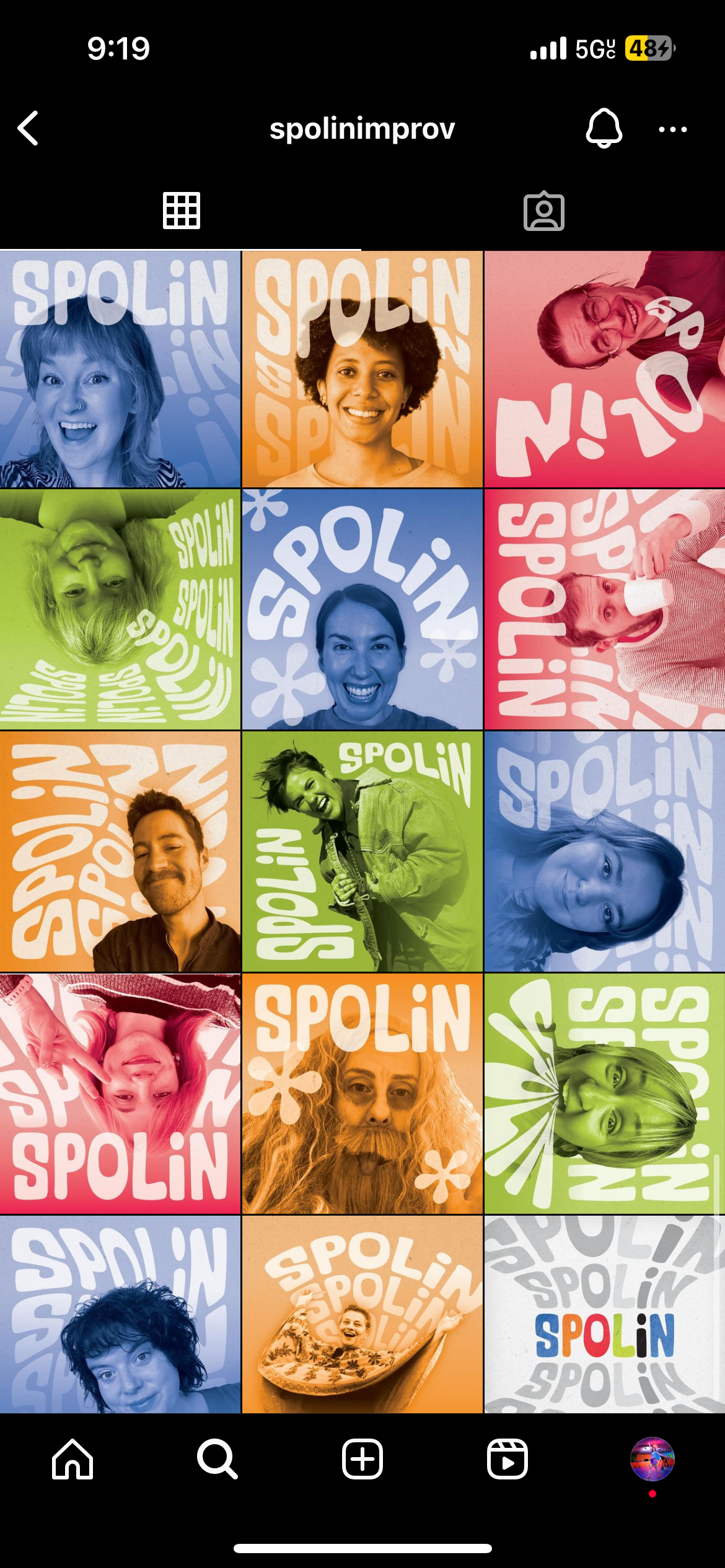
I then created cast intros for social media using selfies from each cast member, and using the color palette from the poster. Each cast intro is unique but was unmistakably true to the Spolin Identity, which led to a fun but cohesive instagram feed.
Conclusion: The show graphics were received extremely well, which most of the cast sharing their cast intro graphics with their friends, which helped spread the work about the show. We got excellent audience feedback about the posters, and attendance for the show increased over the duration of the 3 month run, which is rare for a summer show at Huge Theater.

Social media poster

Full Size poster

Social media feed

Cast intro graphic for social media

Cast Intro for social media

Cast intro for social media

Cast intro for social media

