Relapse
Situation: Alex Church, the creator of an original rock musical titled "Relapse," was going to produce a staged reading and wanted to promote it effectively. The musical delved into the harrowing experience of caring for a loved one grappling with addiction, and he desired promotional graphics that could vividly convey the emotional turbulence and anguish central to the production.
Task: I was tasked with designing promotional graphics for "Relapse" that communicated the raw and unsettling nature of addiction, portraying the pain and turmoil faced by those involved in such a struggle, and generate interest in the musical.
Design Approach:
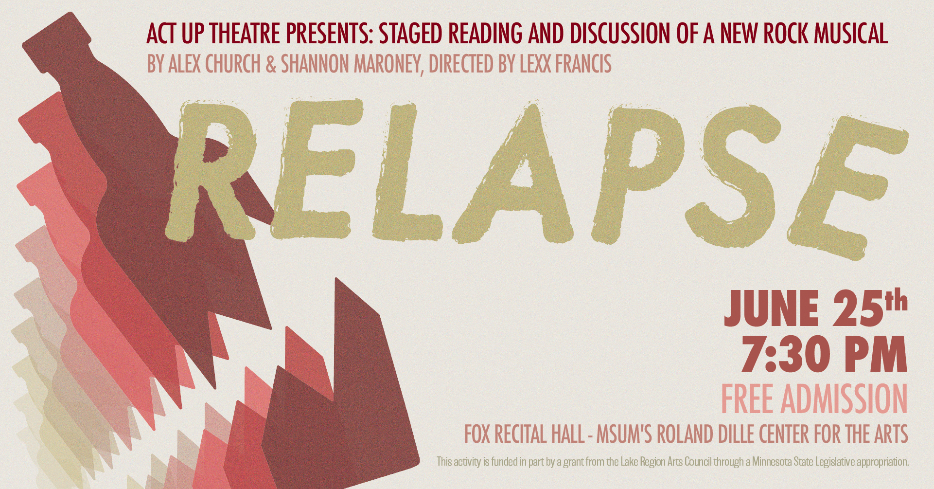
I began by brainstorming multiple design concepts that could effectively capture the essence of addiction and its impact on loved ones. After considering various approaches, we decided to focus on the theme of "breaking" to represent the destructive nature of addiction, and to play with repetition as a symbol for relapse.
I selected a breaking bottle as the central visual element. This symbolized the shattering of hopes, dreams, and relationships due to addiction. The jagged edges of the bottle and the broken glass conveyed a sense of chaos and distress.
I chose a nauseous color palette, combining rusty reds with a jaundiced yellow, to evoke discomfort and unease. These colors were used to underscore the pervasive discomfort of the story. I opted for a bold and distressed typeface that complemented the visuals.
Conclusion: The promotional graphics for "Relapse" successfully conveyed the gritty and painful narrative of the rock musical. The jagged and sickly visual elements, including the breaking bottle motif and nauseous color palette, served as powerful symbols of the emotional turmoil associated with addiction. The promotional materials generated significant interest in the musical, and Alex was happy with the result.


